Incomplete Context: The data shows the busiest airports by passenger count but fails to distinguish between domestic and international travelers. This omission can mislead viewers about an airport’s global significance. A breakdown by traveler type would provide clearer insights into international connectivity.
Skewed Representation: The chart ignores regional population density and airport capacity. High passenger volumes in densely populated areas do not necessarily reflect infrastructure quality. Including capacity utilization or regional context would offer a more balanced interpretation.
Idiom Issues:
Confusing Dual Encoding: Passenger numbers are shown with both exact figures and dot representations (each dot = 1 million passengers). This redundant encoding adds unnecessary complexity and distracts from straightforward comparisons.
Unclear Color Usage: Bright colors are used to indicate rankings or regions without a clear hierarchy or legend, potentially causing misinterpretation. A structured color scheme with clear labels would enhance understanding.
Chartjunk: Decorative icons and embellishments clutter the visualization, detracting from the data. Removing these distractions would help keep the focus on the core message.
Suggestions for Improvement:
Use Clean Bar or Column Charts: Opt for horizontal bar charts to allow direct comparison and emphasize exact values in a straightforward format.
Establish Clear Color Coding: Assign color schemes based on categories (region or domestic/international status) and include a simple legend to reinforce understanding.
Reduce Clutter: Minimize background illustrations and large icons. Focus on clean, balanced spacing that draws attention to the ranking and key numbers.
Incorporate Key Annotations and Headlines: Use concise annotations to highlight notable trends (such as airports with the fastest recovery) to add narrative depth and engagement.
Highlight Top Performers Visually: Make the top airports stand out with bold fonts, larger figures, or distinct framing to guide viewer focus effectively.
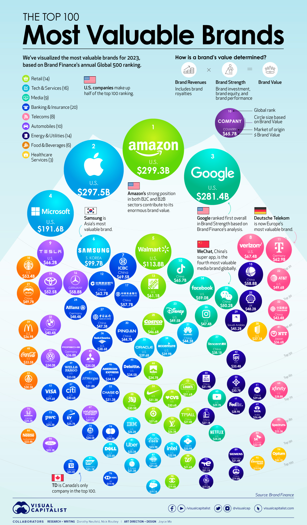
Visualization 2: "Top 100 Most Valuable Brands in 2023"
Relative vs. Absolute Growth Confusion: The visualization focuses on percentage growth without showing base values, which can mislead viewers into overestimating the significance of certain growth figures. Displaying both metrics would provide fuller context and prevent misinterpretation.
Data Aggregation Without Clear Structure:Mixing sectors like tech, retail, and food brands in a single visualization without segmentation makes comparative analysis challenging. Categorization is necessary for understanding inter-industry dynamics.
Idiom Issues:
Bubble Chart Limitations: Using bubble areas to represent values can distort perception and exaggerate differences, especially for brands with close figures. This reduces accuracy in comparative assessment.
Complex Legend and Lack of Visual Hierarchy: The legend is unintuitive, requiring constant reference, and the design lacks a clear focal point. This makes it hard to interpret key takeaways quickly.
Clutter and Overlapping Bubbles:Bubbles overlap, obscuring smaller brands and making the layout dense and confusing. This compromises the clarity and usefulness of the visualization.
Suggestions for Improvement:
Replace with Sorted Bar Charts or Small Multiples: A clean bar chart or small multiple layout by industry would enhance readability and comparative understanding.
Clear Sector Groupings: Color-code and visually separate industries with labeled group headings for quick navigation and comprehension.
Highlight Key Brands and Changes: Draw attention to top brands or key changes with callouts or annotations that add storytelling value.
Maintain Clear Visual Spacing: Maintain clear spacing between elements to reduce clutter and increase readability.
Emphasize Simplicity and Hierarchy: Use typography, font size, and strategic spacing to emphasize key data points and ensure the poster remains visually approachable.